Here are four graphics that popped up on my LinkedIn feed
yesterday that I found interesting.
1)
Graphic 1: Offshore Wind Components, Varieties,
and Configurations. This comes from Dan Swenson and the Bureau of Ocean Energy Management
2)
Graphic 2: This one is from S&P Global and
shows the drastic differences in natural gas prices between 2022 and 2023 in
the PJM Interconnection region of the U.S. Northeast and Midwest. The region
has an abundance of natural gas due to the reserves of the Appalachian region’s
Marcellus and Utica Shale formations. Gas pricing in 2022 was following global
gas pricing and did not really reflect the supply-demand issues in the region.
3)
Graphic 3: Energy Transition Hype. This graph by
Enverus attempts to compare different energy transition technologies by showing
which ones are more feasible and which ones are relying more on hype. The
technologies on the left have more uncertainty and those on the right have less
uncertainty and are at or closer to full commercialization. The technologies
further to the left will likely see more scrutiny from investors before they
are proved up as commercially feasible.
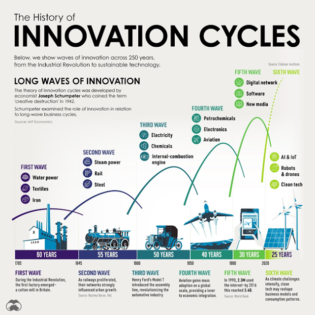
4) Graphic 4: Innovation Cycles. This one is from MIT Economics and is based on the work of economist Joseph Schumpeter from the 1940’s. The graphic refers to waves of business innovation cycles initiated by groups of new technologies.


No comments:
Post a Comment